
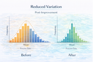
Histogram in Six Sigma: A Practical Guide to Understanding Process Behavior and Data Distribution – Part 1
In process improvement, the most dangerous phrase is:
“The average looks fine.”
Averages hide problems. Two processes can have the same mean and standard deviation, yet behave completely differently. This is why quality professionals rely on visual tools—and among the 7 QC tools, the Histogram is one of the most powerful for making data behavior visible.
A histogram does not just summarize numbers; it reveals the shape of reality. It helps teams quickly see:
- Where most values cluster (approximate mean)
- How wide the variation is (dispersion)
- Whether the data is symmetric or skewed
- Whether there are outliers
- Whether the process has one peak (unimodal) or multiple peaks (bimodal/multimodal)
In Lean Six Sigma projects—especially in Measure and Analyze phases—histograms provide the first honest look at how a process is performing.

What Is a Histogram (in Simple Terms)?
A histogram is a bar chart that shows how frequently data points fall within defined ranges (called bins or classes). Each bar represents a range of values, and the height of the bar shows how many observations fall into that range.
Unlike a simple bar chart of categories, a histogram is used for continuous data such as:
- Height
- Weight
- Diameter
- Time
- Cost
- Cycle time
- Response time
It is particularly useful to understand:
- Approximate location of the mean
- Spread/variation in data
- Skewness (left or right)
- Presence of outliers
- Distribution type (normal, bimodal, multimodal)
Why Histograms Matter in Lean Six Sigma
In Lean Six Sigma, decisions must be data-driven. Histograms help teams move from assumptions to evidence. They are commonly used in:
- Measure phase: to understand baseline performance
- Analyze phase: to explore patterns and variation
- Control phase: to monitor stability over time (in combination with control charts)
Histograms answer critical questions:
- Is the process centered around the target?
- Is variation too wide?
- Are there hidden sub-populations?
- Are there extreme values (outliers) that need investigation?
By visually displaying distribution, histograms reveal patterns that numeric summaries alone can hide.